ZARICHNYY APARTMENT
Interior Project: Private apartment
Owner: Elena & Artem - entrepreneurs
Interior Designer: Dan Vakhrameyev
Construction Coordinator: Yuriy Vakhrameyev & Anatoly Hutnyk
Location: ZARICHNYY, Kyiv, Ukraine
Project Area: 99 sq.m
Completion date: June 2020
All photos by Andriy Bezuglov / bezuglov.ua
Simplification and unification are the components of +kouple’s interior design style. Minimalist interior design involves using bare essentials to create a simple and uncluttered space. It’s crucial to maintain a balance between clean minimalism and a certain level of cozy atmosphere.
“Our main focus at +kouple is to be a lighting brand. On rare occasions, we develop and execute interior design projects provided we share a common vision, taste and overall aesthetic with a potential client, who will later most certainly become our friend.” – says Dan, +kouple founder, creative director.
Structurally, there were absolutely no opportunities for the reconfiguration of the space because all the walls in the apartment are load-bearing. The bathroom was the only relatively flexible space, but it also had certain creative limitations.
The kitchen design was influenced by Asian simplicity and practicality.
Furthermore, with the focus placed on functionality, we were again limited by the square meters and had to adjust our kitchen needs based on the location of the load-bearing walls. The built-in furniture combines the kitchen with the main living area. It consists of a variety of cabinets, open shelving, a built-in refrigerator, a dishwasher, an oven and a separate space for a TV.
From a design perspective, it is ideal not to be cluttered or overwhelmed with different forms; therefore, by focusing on what’s essential, we want to minimize an unnecessary variety of materials and forms. In line with our fundamental concept of providing a comfortable and relaxing atmosphere, we designed a multifunctional modular sofa in neutral light-grey grain fabric.
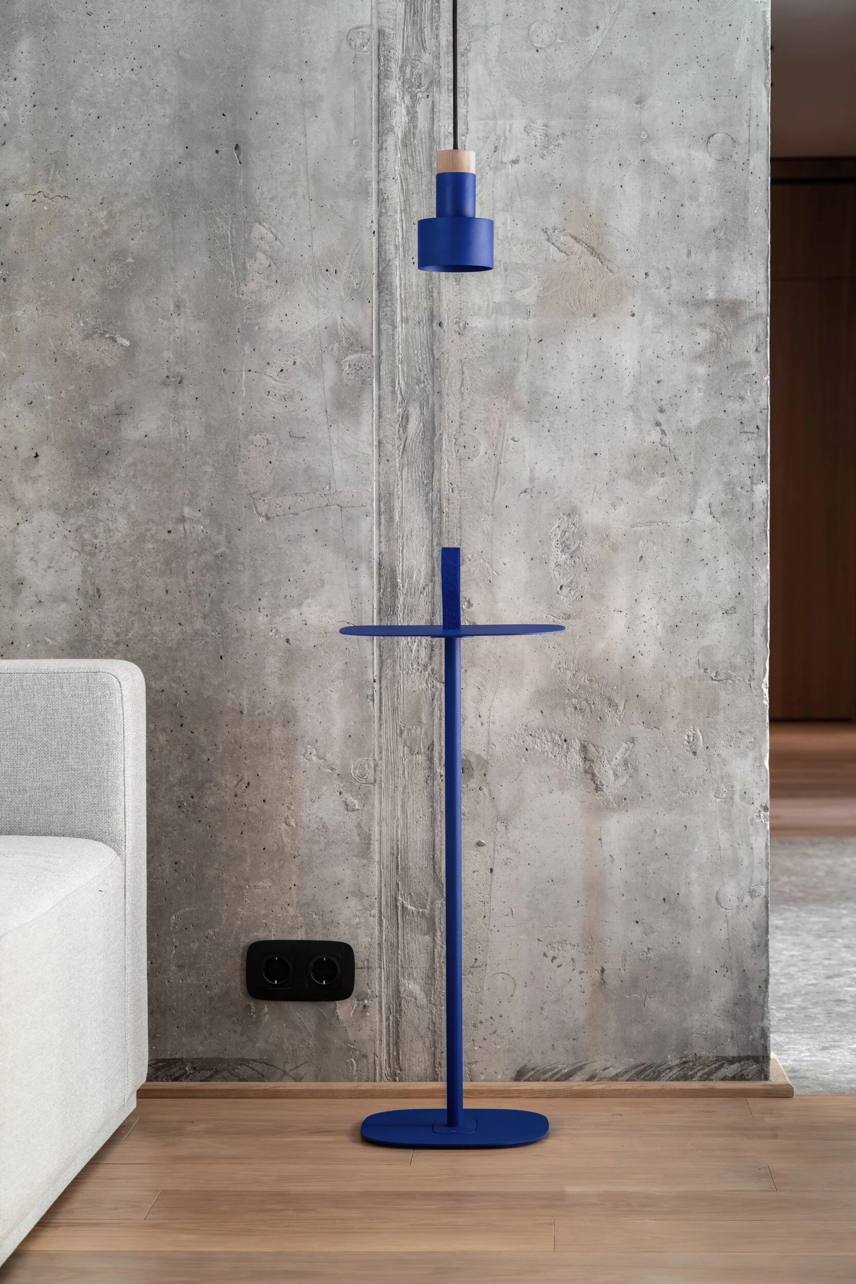
Archi ceiling lights by our brand +kouple are installed as the main downlights. The client chose to have SO5 Spot lamps from our Sustainable Origins collection above the dining table while the pendant Radius lamp in Ultra Blue creates a pop of color.
Although the room size doesn’t always directly correlate with the perception of spaciousness, it was still a challenge to maintain clean lines as well as an intelligent and uncluttered layout. We managed to make the hallway 40 cm wider by moving one of the walls; we also created built-ins that separate the entry way from one of the studies while being functional design elements for both spaces.
Working on the bathroom layout was a real challenge due to its utterly small size and our bold ambition to create a fully functional, comfortable and stylish bathroom for two people. We have managed to properly incorporate all the requested elements: a custom-made double vanity basin, an eye-catching freestanding bathtub, a separate shower, a toilet, wall shelves and plenty of storage space under the sinks.
Light grey Cappo di Gres textural ceramic tile was used in combination with original concrete patterns and balanced out with natural wood tone furniture. The en suite bathroom can be either entered from the master bedroom or a hallway; both doors have privacy locks.
We obviously continue with the simplicity of shapes in the bedroom aesthetic.
The emphasis on defined clean lines is further reflected in the design of the open closet, which is simultaneously a unique entry way into the master bedroom. It not only reveals a great level of functionality, but also provides everything one can ask for in a standard dressing room.
Here, yet again, an Ultra Blue Radius pendant lamp by +kouple makes a statement in an otherwise calm and restful color palate of the room.
Every piece of furniture should have a distinctive purpose in the living space and should be functional. For this particular project, we intended to achieve clean lines, practical storage solutions, and subtle furniture shapes that would not stand out too much.
Hidden doors, smooth gaps and barely perceptible yet intentional design elements help create an aesthetically refined space.
You must take your time and look deeper to profoundly appreciate the surroundings. Floor to ceiling wooden panels were installed to visually raise the roof and increase the sense of space. The window frames are finished with wooden panels adding even more coziness to the dwelling.
All the furniture was custom made by Verdi Company according to our technical sketches.
This well-balanced environment was created for a married couple. The apartment offers clean and welcoming spaces that consist of the main living area adjacent to the kitchen, two studies/home offices, a bathroom with two entry ways, and a master bedroom with an open closet.
Color palate of this home consists primarily of warm grey and organic wood tones and plenty of natural light, as well as occasional Ultra Blue accents represented by Radius pedant lamps in the living-room and bedroom.
“We truly believe that your home must be a sanctuary of peace, relaxation and positivity, and the color choices of our design project are meant to highlight this idea.” - says Kateryna, +kouple co–founder, CEO.


